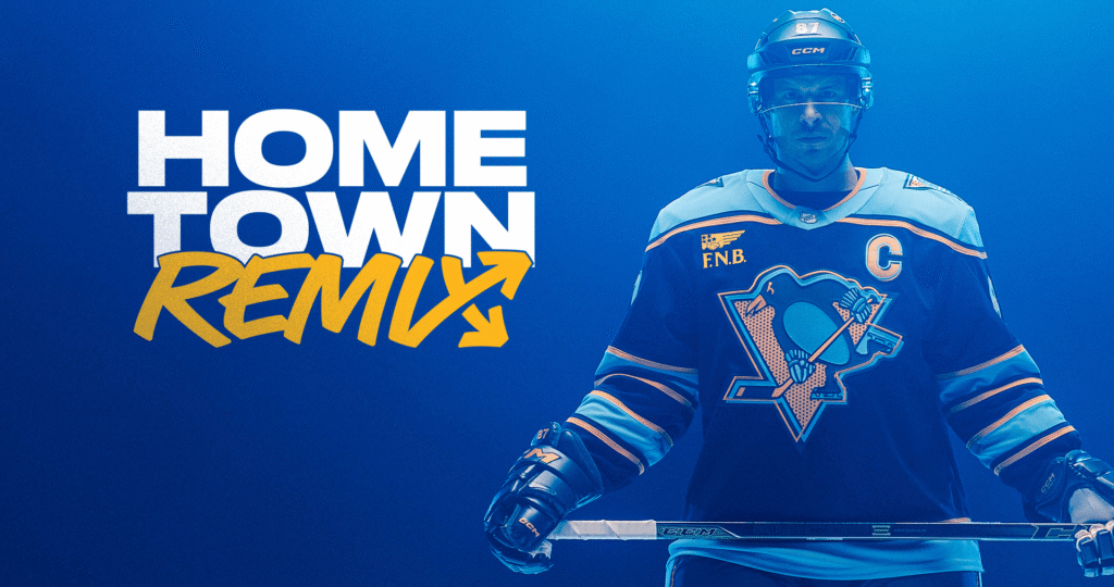
The NHL has found another way to celebrate your hometown. Conveniently, it comes in your size. So, get your wallets out—yet again.
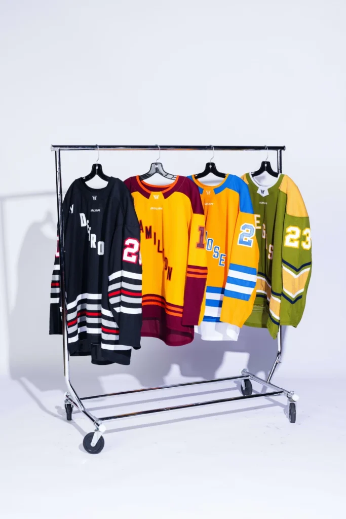
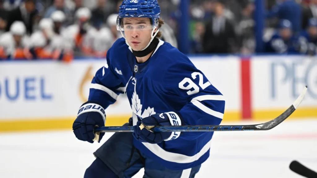
The league and their merchandising partner Fanatics unveiled the new—and often gaudy— Hometown Remix jerseys on November 2, a collection of special-edition uniforms for all 32 teams. These are actual game uniforms, rather than something players will briefly model before disappearing down the tunnel. Each club will wear its version several times during the 2026–27 season. The idea—aside from pure greed—is to put more of each city into its team’s sweater: local landmarks, neighbourhood character, cultural references and details that mean something to the people who live there. Naturally, there is also an accompanying assortment of clothing (hats, hoodies, shirts and other apparel) to help those people express how much it means.
To see all 32 designs, click here.
Fanatics developed the collection in collaboration with the NHL and its individual clubs over approximately two years. It is the company’s first special-edition uniform program encompassing all 32 teams since becoming the NHL’s on-ice outfitter in 2024. The creative work was handled by Fanatics’ in-house designers, with Dom Fillion, its vice-president of creative design and innovation, explaining the process publicly. Teams were presented with different concepts and helped determine the colours, lettering, imagery and local stories incorporated into their uniforms. Clubs could refine a proposal or suggest another direction. In other words, this wasn’t one designer deciding that Chicago should suddenly be green and sending everyone an invoice.
Fans who remember Adidas’ Reverse Retro collections will recognize the general arrangement: everybody gets another sweater, everybody has an opinion, and some people discover that their jersey collection is no longer complete. The creative premise is different, however. Reverse Retro revisited uniforms from a team’s past. Hometown Remix gives designers a broader assignment built around the city and its fans, with room for historical references without requiring the entire design to look backward.
Some teams have made relatively restrained changes. Others appear to have given the design department permission to stay late. Chicago has regretably made green its dominant colour. Boston has gone brown with a college-inspired appearance. Carolina has put its hog mascot, Stormy, on the front of its sweater—an unusually literal opportunity for opponents to say the Hurricanes hogged the puck all night long.
Calgary pays tribute to the Saddledome, incorporating references to the building’s roofline, windows and interior. Montreal draws on the city’s architecture and cultural heritage, with stonework-inspired crest detailing and sleeve symbols including a fleur-de-lys, rose, thistle, clover and white pine. Vancouver takes its inspiration from the city after dark, with deep blues, a skyline reflected in the water and a reference to the lions at Lions Gate Bridge. There are also collection-wide identifiers, including Hometown Remix branding inside the back collar and an arrows logo on the hem loop. Some of the textured details will be much easier to appreciate up close than from the upper bowl.
Because the jerseys are “alternate” the collection includes both light and dark designs. A white Hometown Remix sweater does not automatically mean a road jersey. Montreal, for example, has scheduled its white version for 10 appearances, including eight at home. In practical terms, the uniforms for those games must be coordinated so the opponents remain distinguishable. Fans should therefore expect occasional departures from the familiar sight of the home team in dark sweaters and the visitors in white.
The rollout began November 2 with Florida, Chicago and San Jose. Across the season, 261 games will feature at least one team in Hometown Remix uniforms, including 19 games with both teams wearing their new looks. Individual clubs have their own schedules.
But the NHL has already accomplished one thing: for a few days, fans can argue about something other than their always-awful officiating. And unlike a disputed call, this argument comes with a matching hat. While beauty is in the eye of the beholder, and many (most?) will not agree, HockeySpy.ca has divided the new look uni’s into three categories:
THE TOP TEN (In no particular order)
Carolina, Colorado, Dallas, Minnesota, Nashville, San Jose, St. Louis, Utah, Winnipeg, Buffalo
THE JUST OKAY DOZEN (In no particular order)
Boston, Calgary, Detroit, Los Angeles, Montreal, Washington, New Jersey, NY Rangers, Toronto, Philadelphia, Vancouver, Seattle, Tampa Bay
THE LAUGHABLY HORRIBLE (In no particular order)
Anaheim (Colours from hell), Chicago (Green? Really? Green?), Columbus (Grey has us feeling blue), Edmonton (Depressing), Florida (PWHL style?), Ottawa (Almost the same as current third jersey), Pittsburgh (A franchise that changes their look, logo and colours as frequently as we change our socks), Las Vegas (they gambled on this jersey and lost), Los Angeles (WTF? I need my sunglasses).
And finally…drum roll please…the absolute worst of the worst is the NY Islanders decision to bring back the universally ridiculed fisherman’s logo.