Breaking news—both good and bad—from the PWHL’s incoming franchise, the Seattle Torrent!
The good news is—as shown in a brief video here—Hilary Knight has been selected as the team’s inaugural captain for the upcoming 2025–2026 season.
Knight is the ideal choice for good reason: no player in women’s hockey carries a deeper combination of championship pedigree, leadership presence, and global name recognition. She has spent more than a decade as the face of Team USA, winning at every level while elevating the sport through her professionalism and outspoken advocacy. Knight’s ability to guide younger teammates and deliver in pressure moments is unmatched. She gives this expansion franchise immediate credibility. For a new team trying to build identity, culture, and fan connection from day one, there is simply no more reliable or respected foundation than Hilary Knight wearing the “C.”
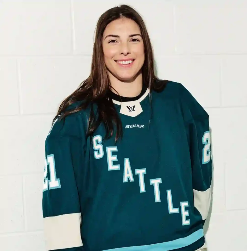
As for the bad news, both the video clip above and the accompanying CBC article here give us our first look at the sweater design Seattle has settled on: a safe, diagonal “Seattle” wordmark that feels more like a generic stand-in than a bold new identity.
Equally disappointing—again based on the CBC article—is that the incoming Vancouver Goldeneyes have apparently decided (or been instructed?) to do the same. Yes, the league has already said full team logos and branding will roll out in a subsequent season, but as first impressions go, the two teams’ front-of-jersey designs are a letdown. At best, they feel like temporary placeholders. At worst, they resemble a marketing ploy forcing die-hard fans to buy two different jerseys over two years. Clearly, this is a design-by-default, not design-by-choice mistake.
As a result, we’re applying the same thumbs-down rating we handed out to the NHL’s Utah Mammoth uniform decision—a rant published here earlier this season.
In an era of both dazzling and laughable home, away, and “third jersey” designs across pro sports, there is no excuse for the lazy decision to simply spell out a team’s city name vertically, horizontally, or any other direction. Sports fans are already familiar with places like Seattle, Vancouver, and Utah; further branding of geographical monikers is unnecessary. With modern design tools readily available, there has been more than enough time to assemble a shortlist of concepts and arrive at a final look worthy of an inaugural season.
